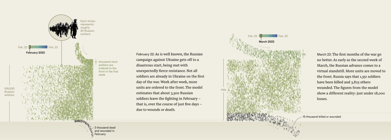
The story unfolds simply, yet brutally: in less than a year, more Russian soldiers had fallen than were initially deployed in February 2022. This conclusion emerged from months spent examining photos of destroyed tanks and perusing death notices of young Russian officers. For more details on the method, refer to this article. Here’s what the end result looked like:
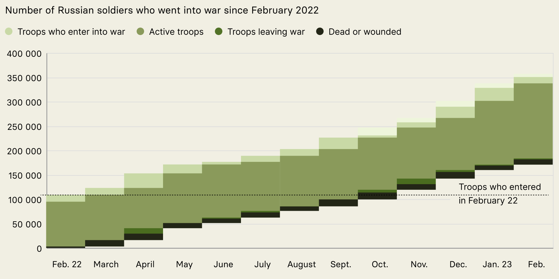
It all began with war analyst Henry Schlottman. He meticulously estimated the losses and reinforcements for each of the more than 100 Russian units active in the Ukraine conflict, week by week. When these estimates were aggregated into months and visualized, the story became clear. Between September and October, the first army had effectively been replaced, according to Schlottman’s data. However, this presentation seemed overly simplistic, a tidy array of colored rectangles that scarcely did justice to the thousands of lives it represented.
At last year's Outlier conference, Nadieh Bremer introduced the concept of using visual variability to bring data visualizations to life. This concept was precisely what was missing from the too-neat rectangles. After all, what could embody chaos and disorder more than the realities of humans in conflict? Bremer explained her approach: she incorporates extra variables into her visualizations subtly when they're available, and introduces randomness when they're not.
Her insights align with findings from experimental aesthetics, which suggest beauty has has two dimensions: clarity or orderliness, which we might call "tidiness", and richness, diversity, or ornateness, akin to "visual variability".
Our approach to introducing visual variability involved depicting individual soldiers as marks randomly placed within the stacked area chart. We quickly realized, however, that displaying a mark for each soldier was unfeasible; troop counts are in the tens of thousands, while mobile screens offer a limited pixel count of 100 to 200 thousand. Plotting one in 20 soldiers is the best we can do. Facing the limitations of current visualization tools, where unit charts and randomness are scarcely considered, we developed a custom workflow.
Custom Visualization Workflow
The process began with a regular stacked area chart, our baseline, plotted using Altair with weeks aggregated into months o make the colored areas as large as possible – and thus have more space to place soldier marks.
Making Shapes Organic
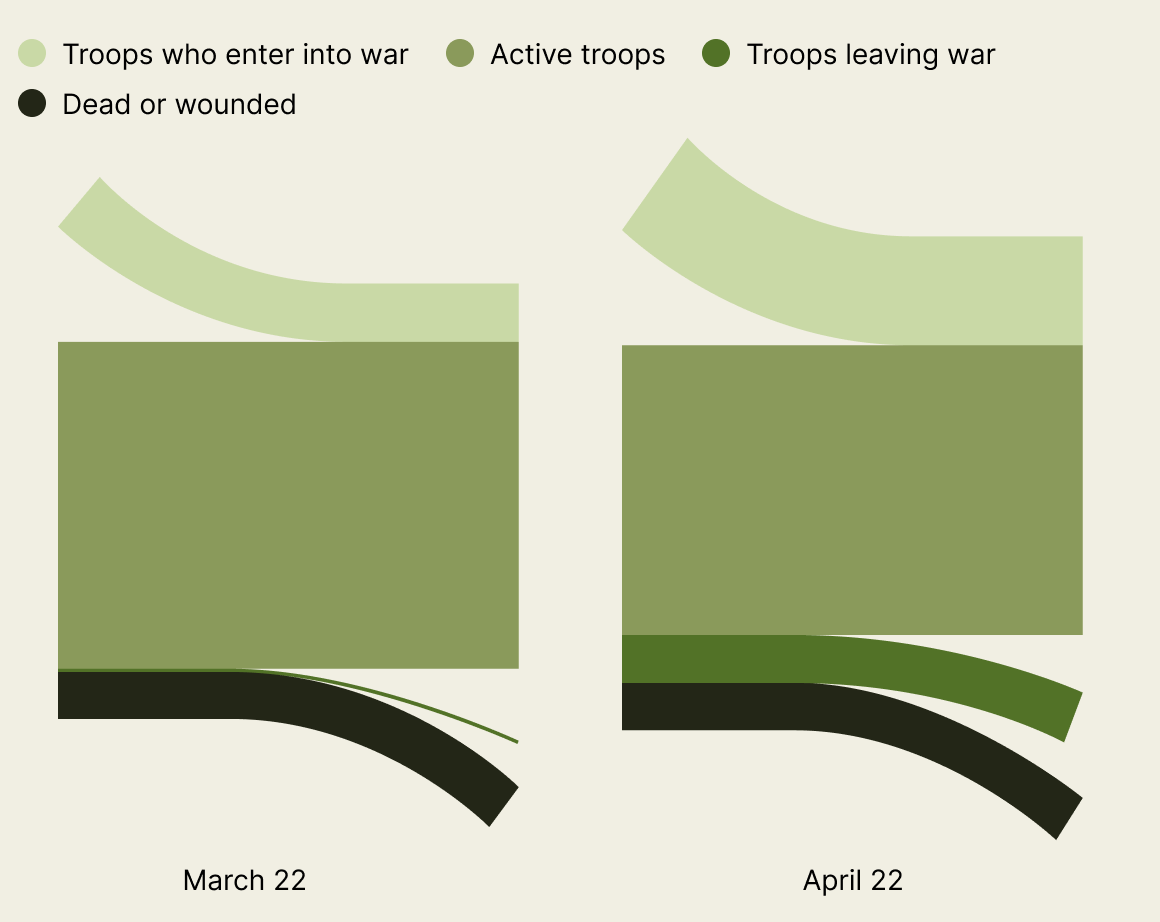
We represented four soldier types with our stacked bars: new recruits, those currently in battle, the wounded or deceased, and those withdrawn from combat. We adopted a flow metaphor, visualizing personnel moving in from the top and exiting at the bottom. We refined these vector shapes in Figma and exported as PNGs.
Random Placement of Soldiers
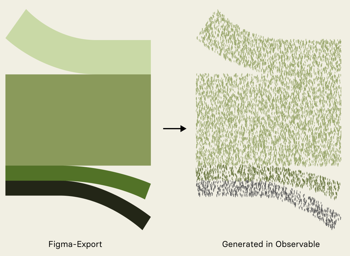
These PNGs were then applied to an HTML canvas, from which we extracted colored pixels as potential positions for our soldier marks. We randomly selected pixels for mark placement, using slightly crooked lines to suggest a moving person from afar. Each line had slight random variations for additional visual variability. Everything was done in an Observable notebook.
Structuring the Battlefield
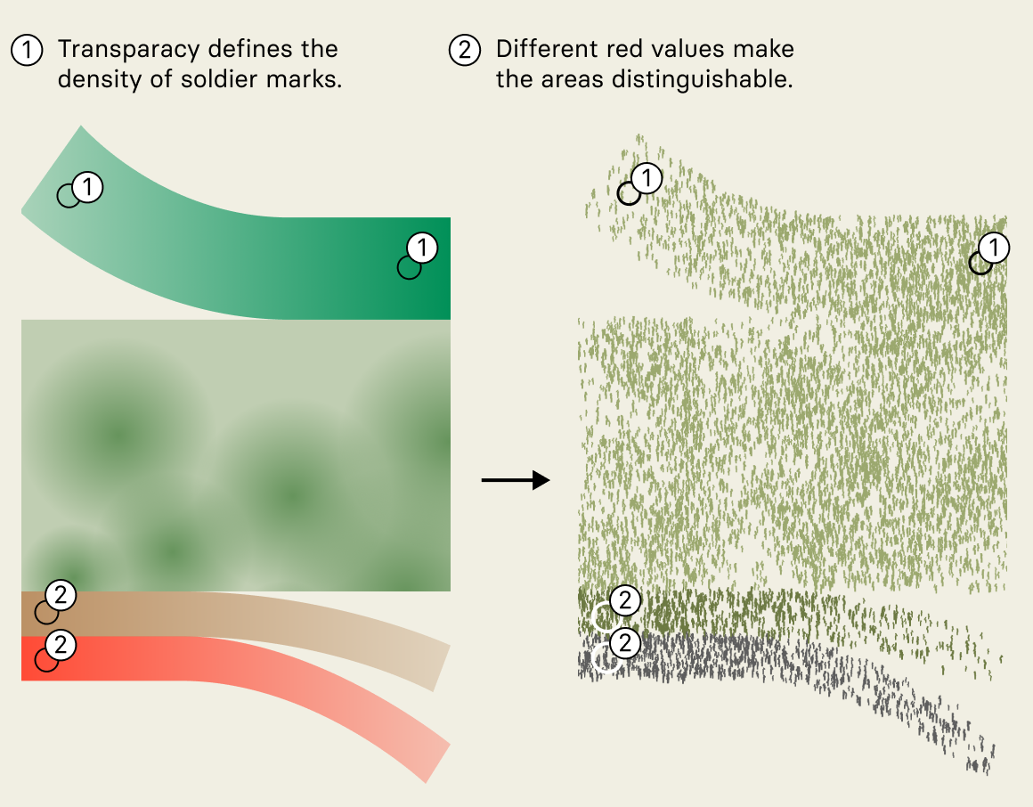
To differentiate between incoming soldiers, those in action, and those departing, we used different colors. Each soldier type was assigned a distinct red hue, enabling pixel distinction during placement. To add even more visual variability, we place the soldiers unevenly within each area. To achieve this, transparency gradients were drawn in Figma and used in Observable to control the likelihood that a soldier mark would be placed. This resulted in higher and lower density areas according the the transparency. The inflowing soldiers get more dense towards the right side for example.
Time and Soldier Trajectories
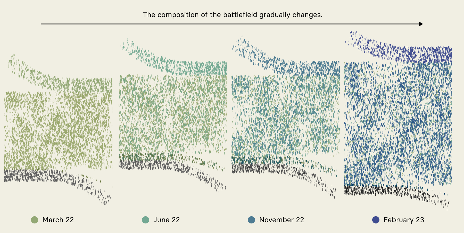
Adding another layer of variability, we encoded the time variable by color-coding each month. We created a small simulation to calculate the composition of the army in each month. As the battlefield changes color over time, you can guess how many soldiers are still fighting from the first offensive. This is another way to show how the first army has been gradually replaced.
Add labels
Finally, we exported the images back to Figma for labeling and annotation, providing clarity and context to our visual story.
Neither common plotting tools like Altair nor design tools like Figma provide good ways to add randomness or to create unit visualization. This opens up a highly interesting area of research as visualization becomes more and more established in visual communication.
